Pictograms are visual symbols that represent objects, actions, or even ideas in a simplified way, meaning they can be understood without text or additional explanations. Their roots go back to the earliest civilizations; today, a pictogram is, for example, an emoji (🙄).
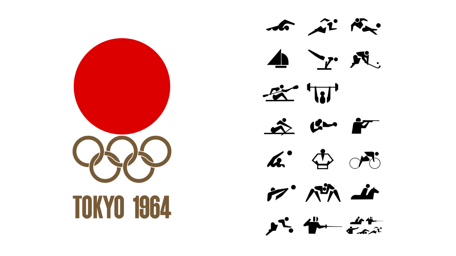
In the context of the Olympic Games, their debut in Tokyo 1964 marked a milestone in universal visual communication, and since then, each edition of the Olympic Games has featured unique pictograms that reflect the culture, style of the host city, or even fundamental ideals of the host society.
Due to its role in World War II, Japan was somewhat isolated from the rest of the world. The Tokyo 1964 Olympics were crucial in showing the world that Japan was capable of being part of the international community. Yoshiro Yamashita was the pioneer who designed the first Olympic pictograms, establishing a universal language that broke down language and cultural barriers and set worldwide precedents in accessibility and language.
The designs for Munich 1972, created by the corporate identity pioneer and branding guru Otl (Otto to his friends) Aicher, stood out for their minimalism and clarity, reflecting the values that the Bauhaus School brought to stay. Thanks to his design concept, he created flexible and coherent visual applications that moved away from boring and obvious uniformity. Aicher compared this system to a grammar that, when well-designed, allowed for playful and free application.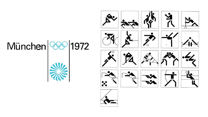
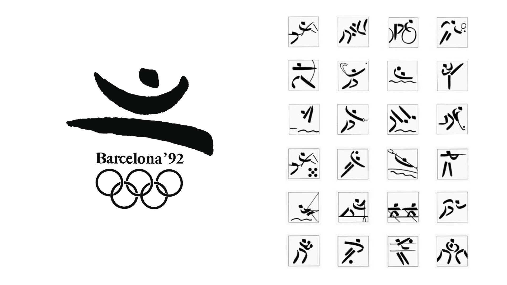
In the visual system for Barcelona 1992, elements of mediterranean culture were incorporated; the undeniable association of Barcelona with Picasso, Miró, Dalí, and Gaudí led designer Josep Maria Trias to find a more human, artistic, warm, and creative language for the Olympic Games. The logo-symbol of Barcelona 92 was a further step towards the modernity that characterizes the city itself: it represented a human body in motion, Barcelona’s leap to the world.
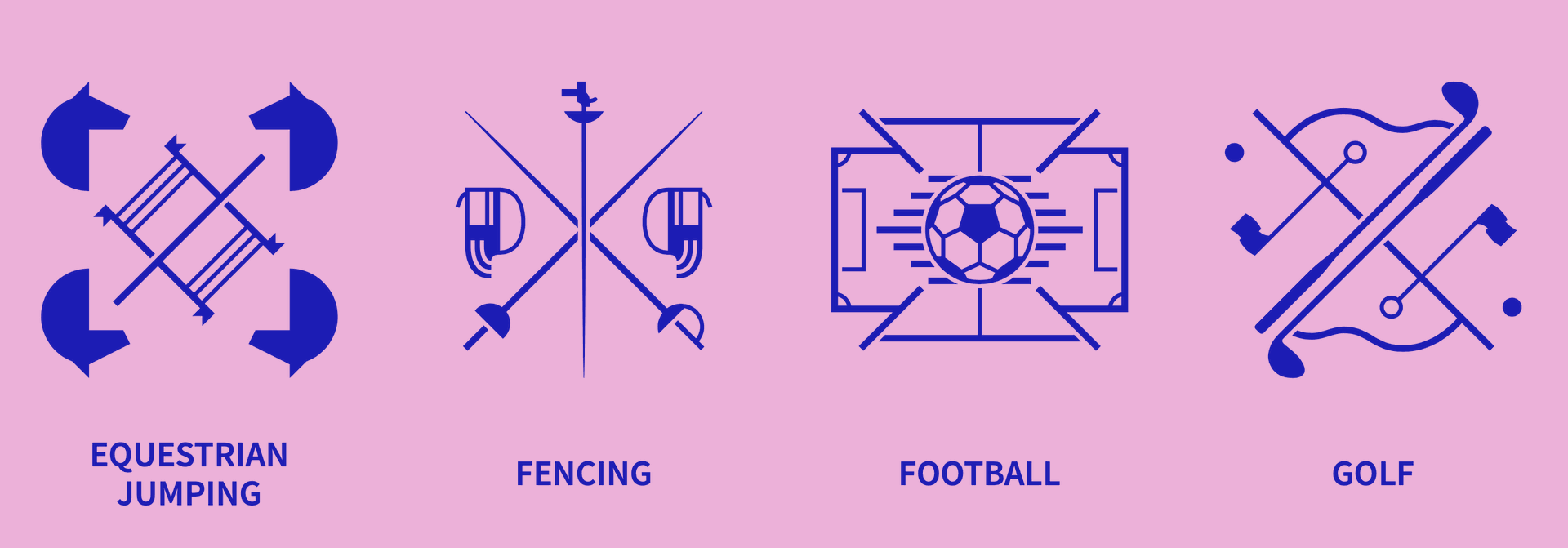
In Paris 2024, the 62 new pictograms continue to surprise, being the first time the human figure has been set aside as the central element of the symbol to give way to a "coat of arms" that represents the essence of each sport. Despite their astonishing variety, each pictogram maintains 3 structural graphic elements:
- A grid or symmetry shape in the form of an X,
- A representation of the game field,
- One or more elements that define/identify the sport.
In the 31 Olympic Games (including winter events) since Tokyo 64, the human-like figure has been the elemental component in Olympic Pictograms. The decision to move away from this stablishment and allow for this innovative system to take place, reinforces, under my understanding, the very purpose of a pictogram: to understand quickly.


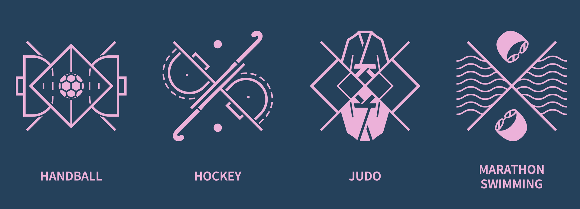

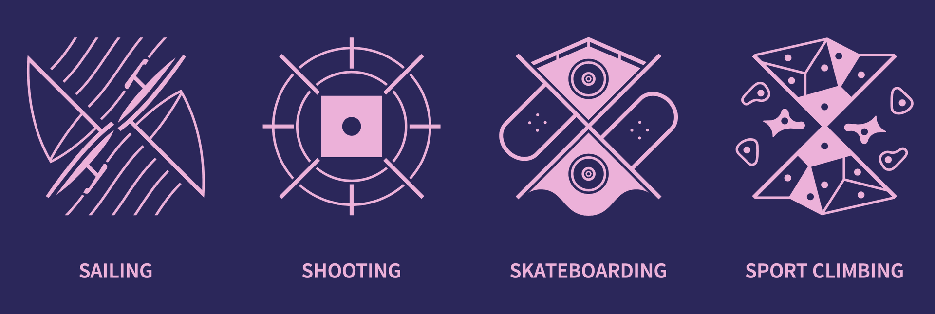
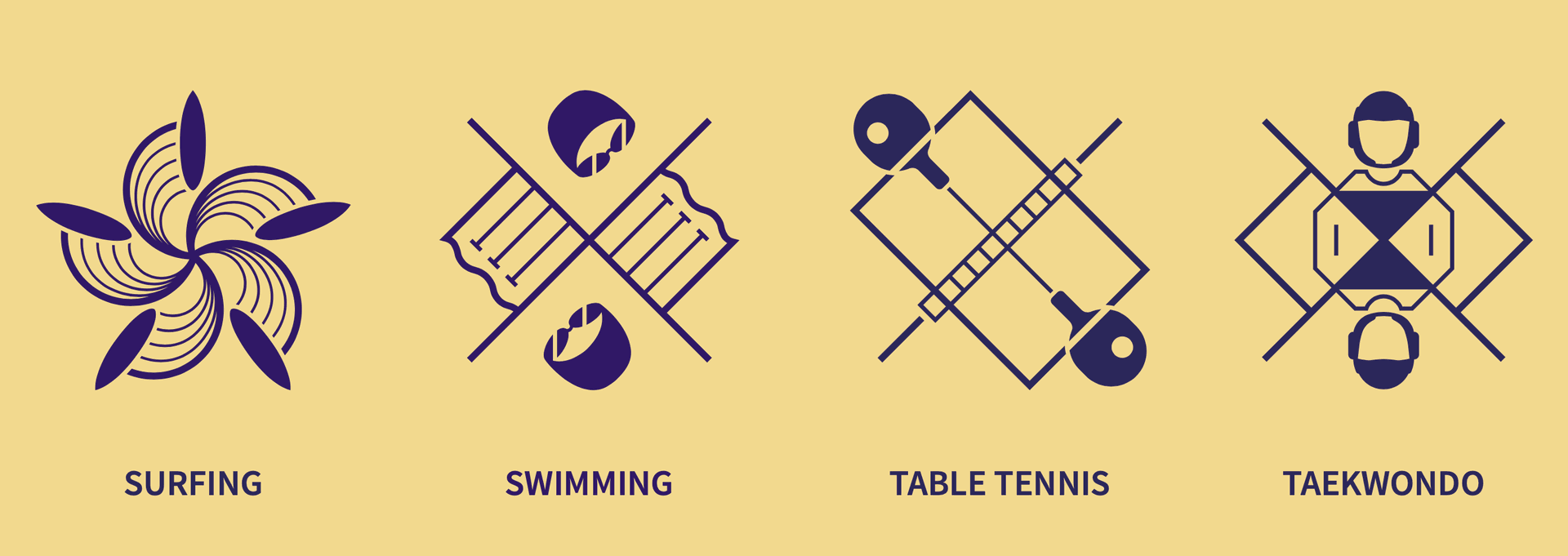
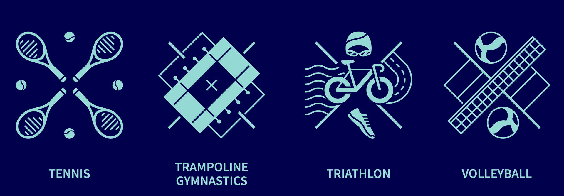
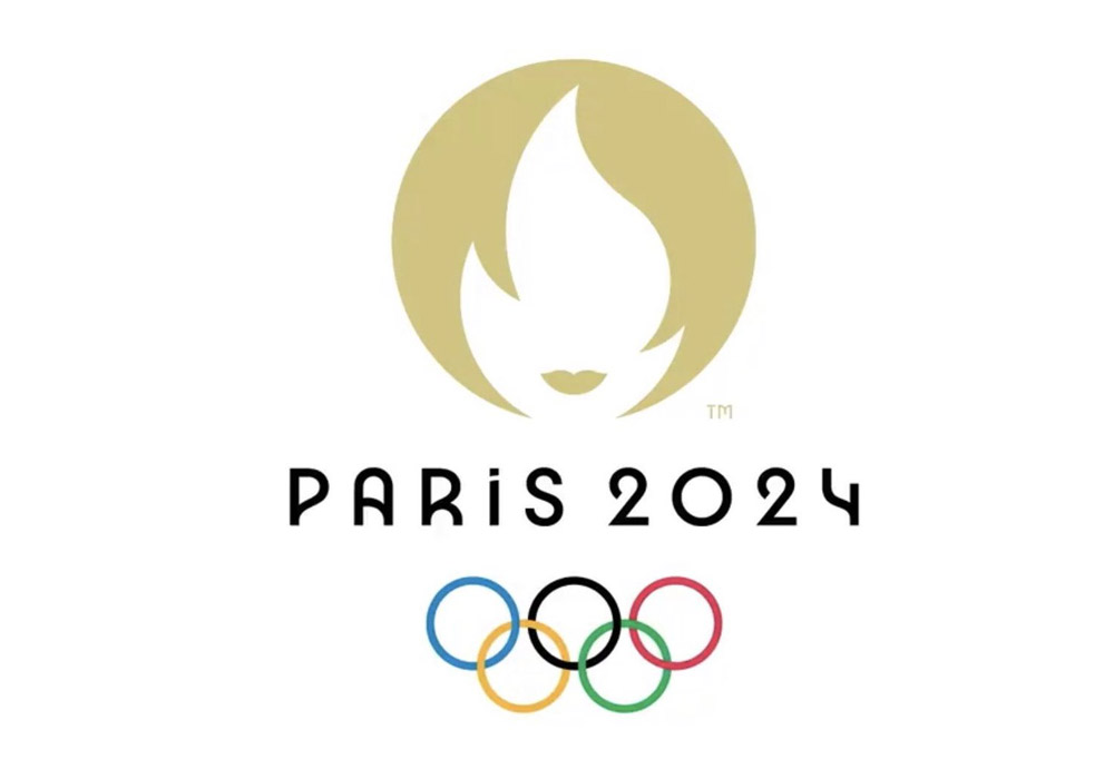
Olympic pictograms have evolved significantly since their debut in Tokyo 1964, reflecting both the cultural context of each host and the intention to create a universal and accessible visual language. From the minimalism of Munich 1972 to the artistic expression of Barcelona 1992, and now with the innovative representation of Paris 2024, these symbols not only facilitate understanding without language barriers but also highlight the creativity and diversity of visual communication.
At Tambo DesignLab🧪, we like to highlight how design can enhance understanding and accessibility in various areas. Just like the Olympic pictograms, the work we do in the creative lab emphasizes the importance of design that is both functional and aesthetically relevant.
If you found it interesting how the evolution of pictograms reflects culture and design over the years, feel free to share this post with anyone you like.
Compartir esta publicación con quien tú quieras
Enviarnos un mensaje o comentario
Continuar leyendo en Tambo DesignLab🧪